
ACE Institute of Technology started out as Ace Training Center in late 1990s. It made its transition to ACE Computer Training Center in early 2000s with this Logo.
![]()
![]()
The process of deliberation went a bit round about to come back to the pyramid that the originators of the school had already been using. This pyramid was part of a Pyramid Chart that illustrated the concept pitch of ACE as how the courses were designed to elevate a students candidacy to be unrivaled in the job market. Below are some of the ideas that we batted away.

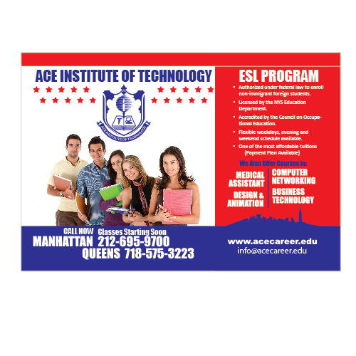
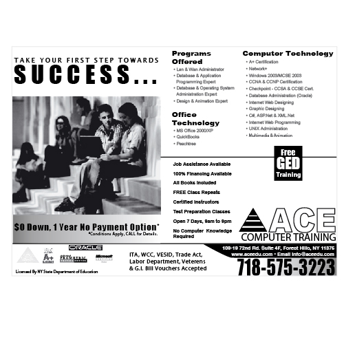
In those early days of this school, the company was not interested in the branding as much as attracting walk in traffic. Ads were going into the community News Papers and candidates were walking in with job opportunities on their minds. Here is one of the flyers they would find in the waiting room.
![]()
![]()
![]()
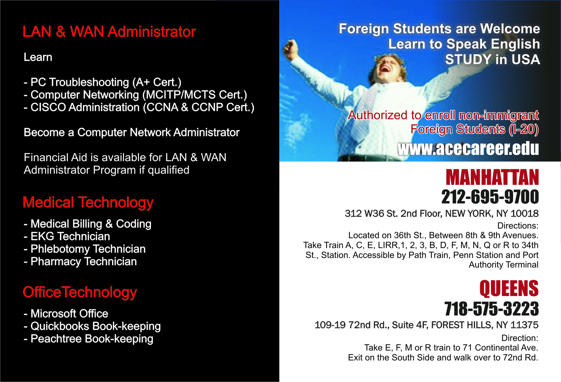
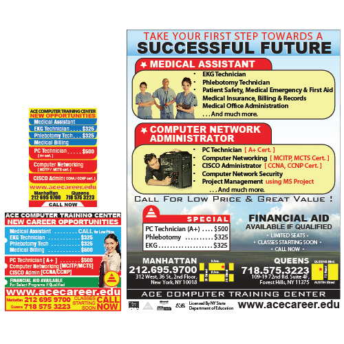
ACE’s marketing model remains the same but their success brought in a bit more budget and we were able to place ACE’s name into increasingly sophisticated venues. More flyers, more merchandise and an increased focus on expansion in both; the physical space and market visibility called for updating the “Look”. That was also the time when I took on the responsibility of ACE Brand from a leadership position and created majority of their brand assets and collateral. Below is the improvement on their Brand Identity in late 2000s.
![]()
![]()
Even though, this improved brand identity was now in full swing – It was not that much of an improvement in company’s attitude towards branding and old model of trying to creep into the classified section of major newspapers was a good floating boat that no one wanted to rock. However, the business did expand and ACE now was a contender in the market. In early to mid 2010s ACE, due to its hard work and due diligence, was able to gain national accreditation. It was no longer a local computer training center but had earned the right to be ACE Institute of Technology. Now, it needed to look as such.
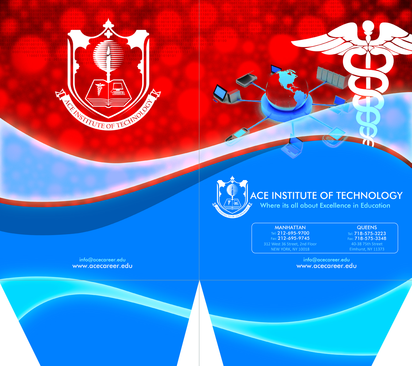
A re-Branding endeavor once again brought me into the leadership position and we were able to recreate the Identity of Ace Institute of Technology with its two prime locations, online presence and print collateral that was reaching Tri-State area. Below is the current logo.
![]()
![]()
Following is the gallery of initial sketches for the concept of ACE Institute of Technology.
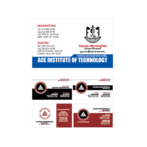
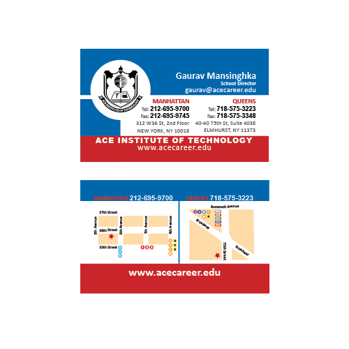
Following is the gallery of some of the print collateral and assets that I created over the years.


Brookwood® Ducks™
Brookwood® Companies had developed these fabrics independent from each...

MultiCam® at Brookwood Companies®
As a branding professional at Brookwood Companies, I successfully...

Brookwood® SILVA™
A Promotional video for Brookwood SILVA. SILVA is a family of fabrics...

Bradford Enterprise
Bradford Enterprises manged the brand of Barbra Taylor Bradford - an...

Ben & Jerry’s
Back in the early days of the internet, when making videos for social...
Sun Charity
An Ad created for the SUN Charity.

Rosh Hashanah
A greeting motion graphics video made for American Friends of Bar-Ilan...

WavesTek Inc.
WavesTek is a small IT management company that has a set of very loyal...
American Friends of Bar-Ilan University
American Friends of Bar-Ilan University keeps its community engaged. The...

Print-Graphics Sample
These are some of the graphics that were all successfully printed and...

LOGO designs
A selection of Logo Designs These are a few logos made in last 20 years....
GALLERIES


0 Comments